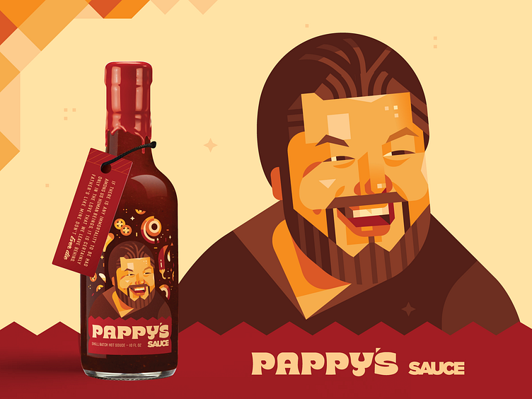
Pappy's Sauce
So honored to be part of this project. Was ask by a friend to create a hot sauce label for their late Father’s signature hot sauce. It soft-launched yesterday within their family in honor of Father’s Day (see last image).
I don’t do a lot of package design these days, and I created several layouts before I was happy with it. What you think of how it turned out? 😊
For the layout we knew we wanted a portrait of his dad to be the feature and we decided to sprinkle some Ingredients around him. The type was a fun customs take on a font called ‘Brice Black Expanded.’ I took cues from the sauce for the color pallet being sure to stick with warm tones to communicate ‘heat.’
Portraits in my style are always a fun challenge but this one felt extra special. The family said I, “captured him well” which warmed my heart.


