Logo progress
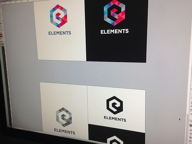
Hey guys, i've progressed with the logo. I've combined Gotham and Gill to make the "L" and the "T" align perfectly to the sides of the logo. Also, I like the friendly "M" from Gill. The text is made a bit wider for the overall balance between text and mark. All distances are measured in "a triangle". I basically use the width of a triangle from the logo to offset and align the type. I can upload a shot to show you that if you're interested? Let me know!
What do you guys think? Maybe some ideas/insights that take the type go up another level?