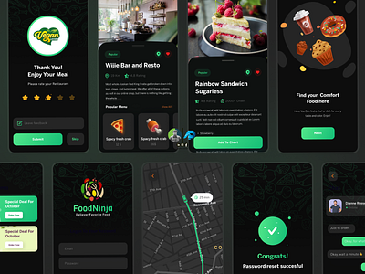
Dark Theme UI
Dark theme in UI/UX.
Dark mode is gentler on the eyes as less blue light is required, meaning fewer negative effects on sleep and general health. (Harvard Health) Gives a productivity boost:
Dark mode UI makes users feel a little less reluctant about working on the computer as the energy-saving benefits help to trigger motivation.
Dark theme UIs can have a subconscious ability to connect a user from their real-life to digital life. For instance, apps that have a day and night mode, like Google maps. When using this during morning times, the UI simply shows everything in a light manner with bright colors. It doesn’t really affect our eyes since there is an abundance of natural light surrounding us. When the sun sets in real life, the UI darkens and signals that we are transitioning into the evening. Not that we need to be told it is night, but this detail gives off an immersive experience that could potentially make a user feel more connected with the app.
#ui #ux #webdesign #design #uidesign #graphicdesign #webdesigner #appdesign #userinterface #interface #dribbble #uxdesign #web #creative #illustration #designer #graphic #illustrator #app #userexperience #inspiration #behance #uitrends #developer #programming #website #logo #webdevelopment #html #android
