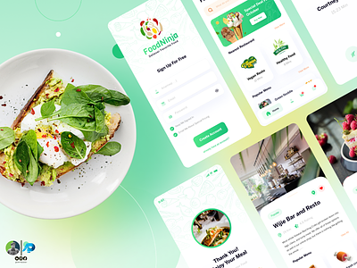
Light Theme UI
Making User Interface in Light Version
As soon as you start designing a new project, one of the first considerations you need to think through is choosing a relevant color scheme for the user interface. It’s important because the color scheme will have a long-lasting impact on the overall user experience of your product. Let’s say, for example, UI is what the car looks like, UX is how it drives or imagine UI as a dating profile, UX is how the date goes — getting Goosebumps already! The point is, UI is much more than a coat of paint that features an entire environment, a multi-faceted construct where everything counts starting from color theory to layout, font selection, and smallest elements like every single pixel.
And here the confusion begins. As an endless flow of choices surrounds us all, we often end up thinking. What’s better, a light-based user interface or a darker one? Or should we let data drive decision-making or simply rely on assumptions or personal preferences? More often than not, there is no cookie-cutter answer to any such decision; it is mainly based on personal preferences and assumptions rather than solid data. In my eyes, anything claimed or predicted without any facts or figures is useless.
Here is one of my project with light theme, the darker version of project will be uploaded tomorrow.
Follow for more design tips and ideas.
