GC Landing Page
Hey dribble! 👋
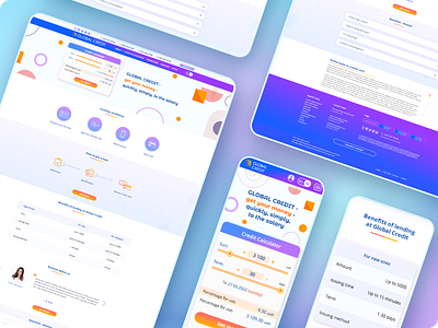
I present the website design of a financial company. The main page is made in the form of a landing page. It consists of the following sections:
Top Bar with contact information;
Navigation with menu, logo and language switches.
Slider for various events, promotions and information, and also contains the most important element throughout the site - a loan calculator with a CTA button.
Section of the conditions of receipt where with the help of icons you can easily get and understand the necessary information.
Table with comparative characteristics for existing and new customers.
Feedback from our customers with photos and text of the review.
The section with the most frequently asked questions in the form of an accordion.
Information block with SEO text.
Footer with sections of useful links, the latest company news, SEO tags, information block, as well as copywriting and bottom navigation.
Color palette in modern trend gradient colors. Font pair Montserrat Alternates and Open Sans. The design was made according to the rules of the GC UI Style Guidelines, which you can read in detail at Behance.
The following tools were used: Figma, Photoshop, Illustrator.
Detailed project description on my Behance profile https://www.behance.net/gallery/149380315/GC-Site-Redesign
What does it look like 👀! Give me your valuable opinion.
==============================================
Don't forget to like👍 and subscribe❤️, there are many interesting and useful things ahead.
I am free for a new project.
Behance | Pinterest | Twitter | LinkedIn | Github | Instagram
Write to the mail: 📩 dedenkof@gmail.com
==============================================
Thank you for your attention!
