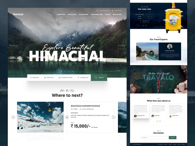
Travelo Case Study
Hello Dribbble,
Travelo is a Digital Advisor. Travelo helped you to plan your complete trips. You can easily find a nearby stay at your destination through this platform. Travelo also gives advice and guidance from Travel experts.
Design
We have created a minimal and clean UI to increase the readability and accessibility of the site. Images and Icons are perfectly edited and created to enhance the overall look of the design.
Colors and Typography
Mostly, Travel enthusiastic people often travel to mountains and beaches. Hence we used Green alongside Blue as primary and secondary colors to make it appealing for the backpackers. Where Green symbolizes Nature, Mountains, New beginnings, and Growth and Blue represents Beaches, Water, Calmness, and Security.
By using a modernized combination of Sans Serif and Script font. Where Sans Serif font, Geomanist conveys Progress and Growth while Script font, The Soulmate sends a positive note representing Fun and Joy.
You can say that Typography and Colors are chosen to create an emotional connection with users which is always a good touch as it helped us to make the platform more interactive and schematic.


