LIRNEasia Solutions Logo
Re-Designing of LIRNEasia logo
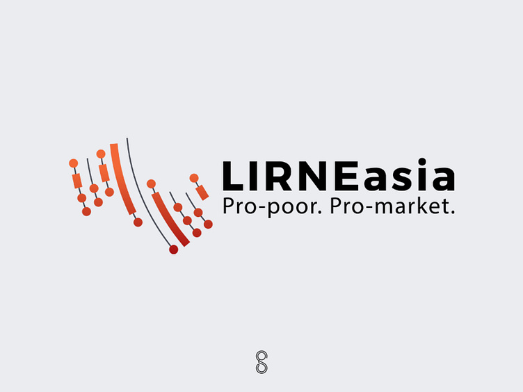
Three years ago LIRNEasia reached out to me to get their logo re-designed. They are a pro-poor, pro-market think tank. They are in favour of decentralized innovation – including through competitive markets – to enhance the lives of the poor. Everything they do has to have benefits for the poor.
Upon presenting the above developed sketches we decided to go ahead with the map concept but with a few revisions.
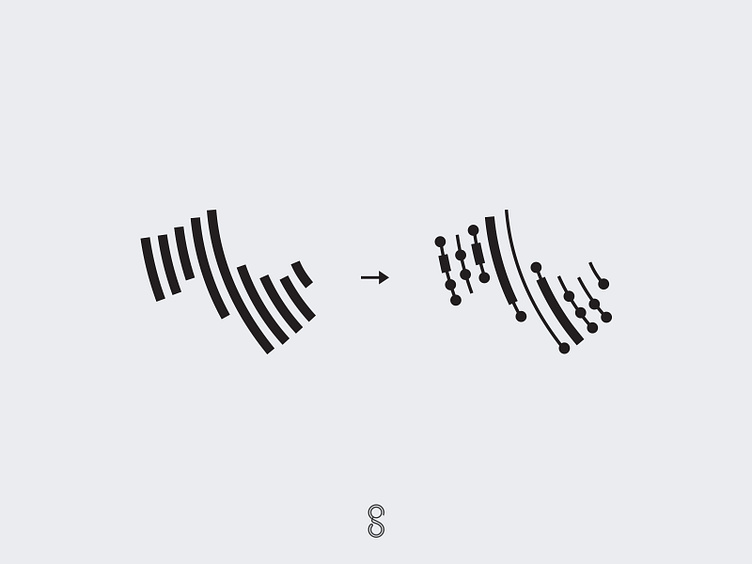
Instead of just lines shaping the region/countries which they operate, we decided to convert the lines into the name "LIRNEasia" written in Morse code.
Logo for LIRNEasia Solutions
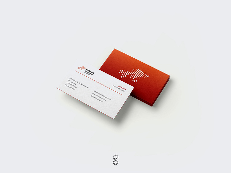
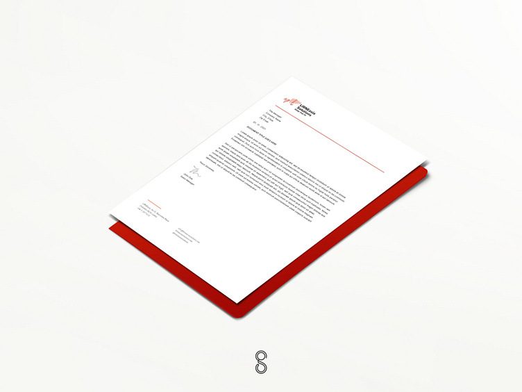
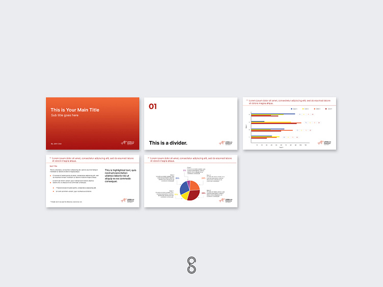
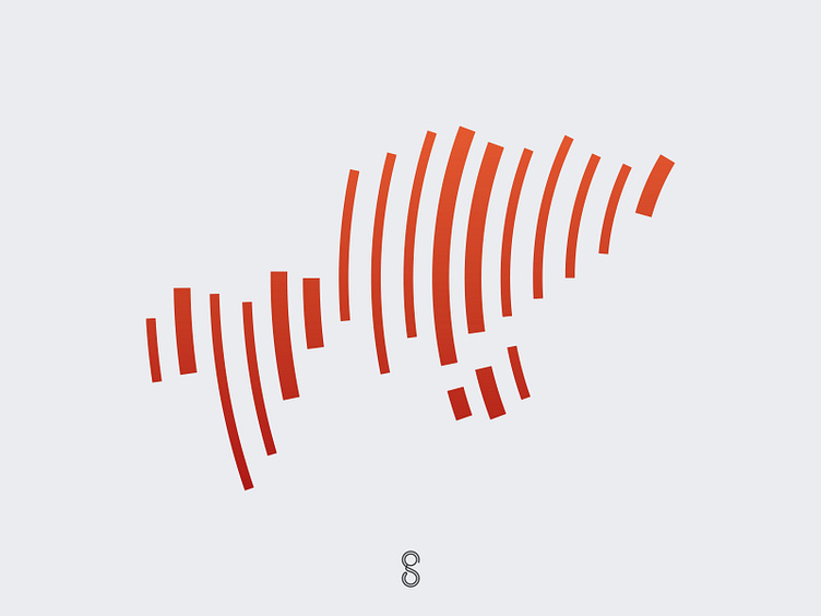
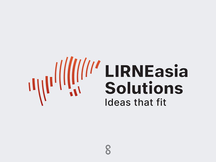
In 2021 they hired me again to design the logo and Brand Identity for LIRNEasia Solutions, which is a consulting firm with a focus on soft and hard infrastructure. They wanted the new company logo to resemble their main logo. And they wanted the design to represent the Regional (Asia and Africa) aspect of their services and Infrastructure; emphasis on Digital.
I decided to keep the colours the same. But in this new concept the letters La (their initials) are depicted in binary code (thick and thin lines to represent 1 and 0) in the shape of the outline of Asia and Africa.
Brand Identity for LIRNEasia Solutions