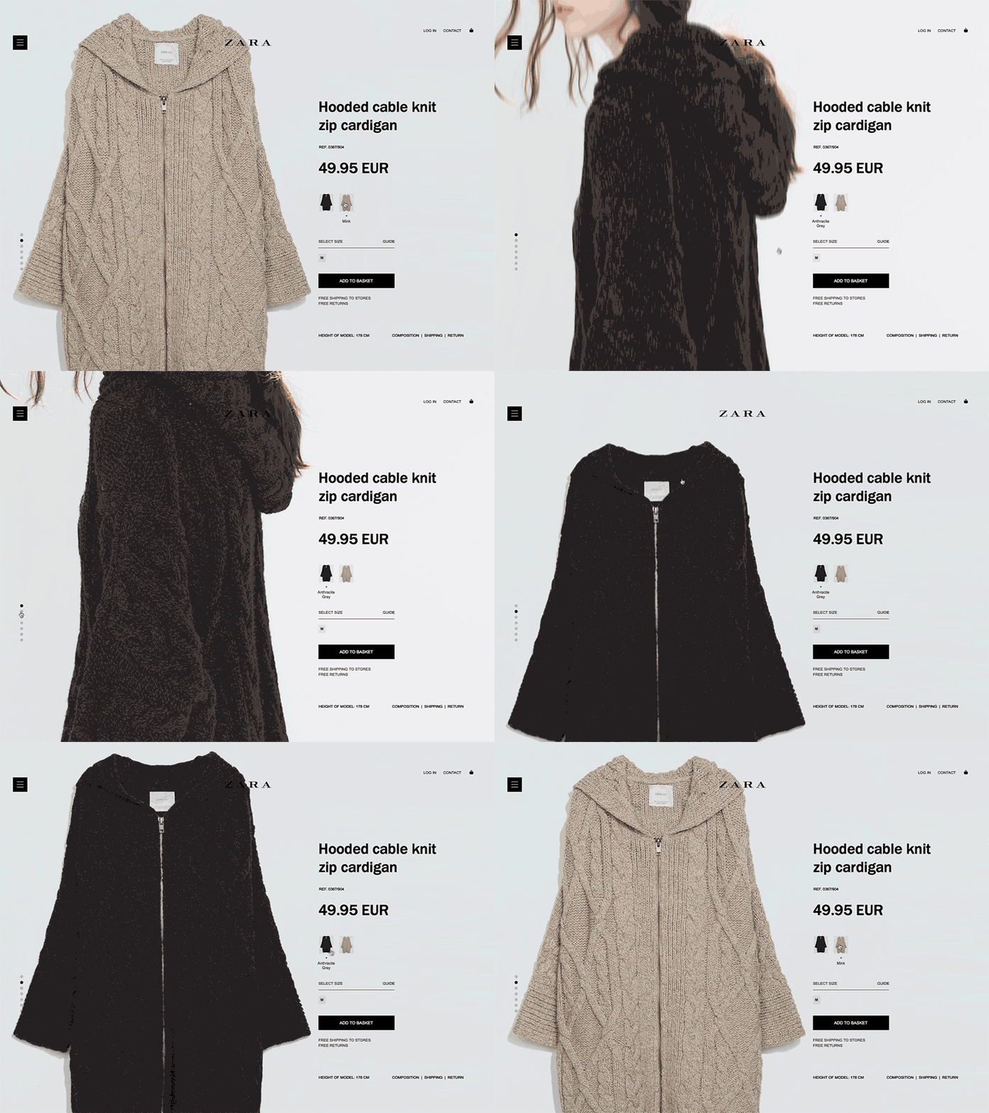
Product Page UX
I was wondering why does almost all of the e-commerce websites has that cluttered interfacish product pages? Aren't the big product pics closes the deal? Why not to add big photos right from the start? So I took ZARA and played a bit in AE...
More by Pavel View profile
Like
