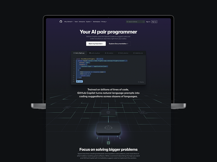
Github Copilot landing page
Github Copilot launched and I got the chance to work on the landing page.
My favorite piece is that perspective grid in the hero — The grid illustrate how Copilot works at a high level by showing a large volume and types (tiles) of inputs (lines) converging through the OpenAI model that then output a single relevant piece of code.
See animated version live: https://github.com/features/copilot/
Shoutout to the brand and site team for the support, it took a village to get this done.
Early explorations for the hero/explainer piece ranging from fairly illustrative using real world reference to computer chip, to abstract leaning into machine learning diagram.
Once we locked in the idea of grid we explored a range of visual artifact to anchor the product on the page. We wanted to find a visual that fitted the perspective while not looking to hardware-esq.
Here is the initial grid sequence animated storyboard. I had a lot of fun making this in procreate to explain what I was envisioning.


