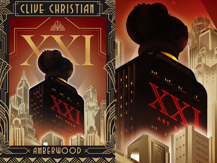
Clive Christian Project - (1)
Recently, I had a chance to collaborate with England-based luxury perfume company Clive Christian to promote their new products - Amberwood and Blonde Amber as an illustrator. This is the first illustration they revealed on their social media so I would like to introduce my work here as well.
https://www.clivechristian.com
https://www.instagram.com/p/Ce6vyj5qPr3/
** Art deco style border pattern designed by Clive Christian (not me)
Initial Sketching
We discussed the perspective first and the client liked my previous work (model tobacco - https://dribbble.com/shots/16401937-Model-Tobacco-Building-Apartments) because of its perspective, amber-ish color palette. So I created rough 3D modeling with C4D and tracing, detailing with Procreate.
I picked the camera angle down to the top view because it allows more dynamic-looking and the negative space for XXI text on the background sky. Also, I felt looking up the camera angle creates more illusion that says "this is the luxury product" instead of showing top to bottom view.
Geometric shapes & atmosphere
Based on the above sketches, I created simple geometric shapes and played around with some colors. The client does not want to have a greenish hue so I recreated it and got the final result.
The overall concept was inspired by Tamara De Lempicka's style.


