Case study: logo for a new Swiss biotech company

LaRive Bio is a startup Swiss biotech company.
They asked me to create a logo and some simple brand guidelines to ensure consistency and clarity in their presentations.
The company's name and the grey and blue colours were already chosen and should be used in the design.
The logo should represent the adventurous and scientific nature of the business and, of course, be distinctive and memorable.
Some initial first ideas...
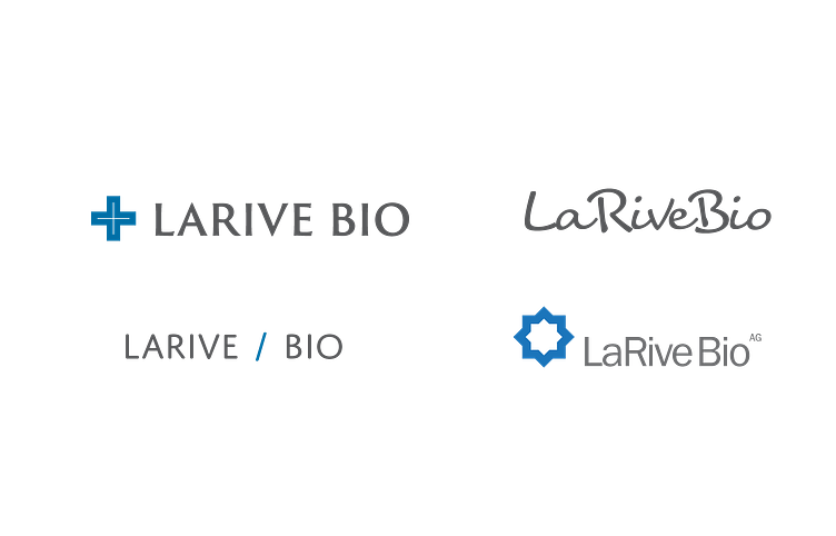
They're okay, but none of them is very strong.
Let's try another approach. There are three organisations connected to the new company so how about using three elements in the logo.
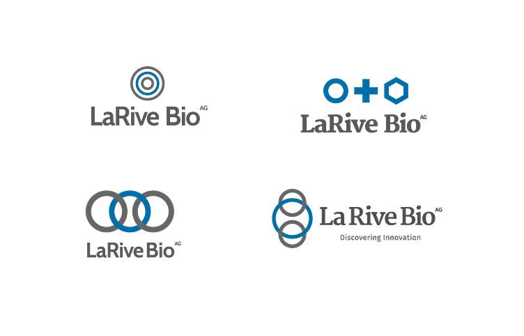
Hmmmm, interlocked circles — neat but has been done before. The hexagon works better and suggests cells, a key element in the business.
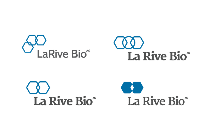
I like the negative space in the filled cells, let's develop that...
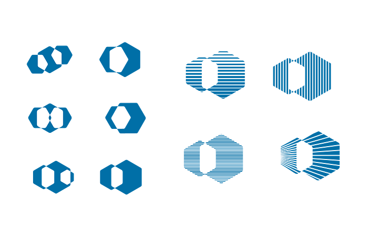
While I like the striped and sunburst versions, I know they won't work well at small sizes. Let's go with the filled version.
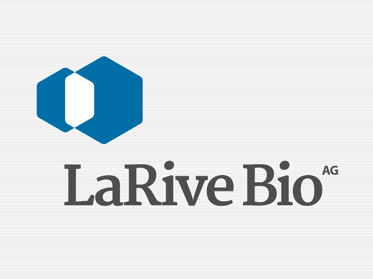
Here's the final version with the selected typeface.
——–—–—–—–—–———
Hello, I'm Gareth and I'm a freelance graphic designer and I work as an external design and marketing resource for businesses small and large.
You can see more work like this at my website: http://www.garethrimmer.co.uk