Visual Identity for Anfix
Hey Dribbblers! 👋
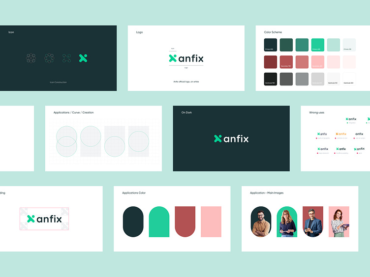
I worked with the Anfix team to make some changes to their visual identity.
The logo icon is inspired by several mathematical symbols that are related to accounting.
Then I used this idea for the visual identity of the site. I used different geometric shapes to combine playful with something more formal and to cover more age segments. It's like a bridge between old accounting and new accounting, 100% digitized and in the cloud.
Let's start creating something special together!
More by Cristian Luchian View profile
Like
