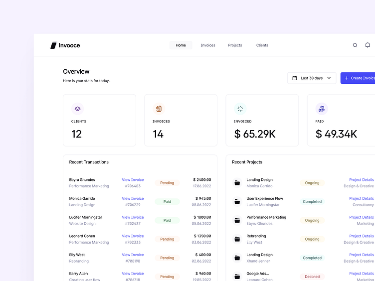
Dashboard Design for Invooce
Hi Guys!
I would like to share with you the first version of the invoice dashboard design that we have been working on for a few weeks. I have shared onboarding and login screens before.
Now let's take a look inside!
Here is the dashboard of an authenticated account.
This is an account that has not yet been authenticated.
You can see it just by looking at the avatar.
Here is our style guide!
I slightly changed the colors I used in the previous login and onboarding screens.
Before, I created it using the HSLuv space, but I recreated the color palette with the LCH space. I haven't made any major changes here, just minor hue differences 😜
Take a quick look.
invooce-dashboard-color-palette.png
300 KB
invooce-Dashboard - Verified User-3.png
700 KB
More by Ragip Diler View profile
Services by Ragip Diler
Like


