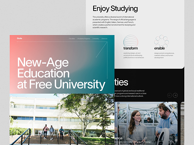
University Website Mobile Version
"The roots of education are bitter, but the fruit is sweet," Aristotle said, and through ages and generations, this thought keeps actual and truthful. Take another glance at our design project inspired by the education theme, the university website, neat and functional, friendly and informative. Here's a couple of screens to give you an idea what it looks like on mobile. Stay tuned to see more!
Also, welcome to check:
• the big collection of our design case studies
• the diverse set of design concepts for business
• the UX practices of product page design
• the guide into the basic elements of a web page
• the tips on how to apply web animation
• the insights into aesthetic-usability effect in UX design
—
Tubik | Tubik Blog | Behance | Instagram | Twitter | Facebook
