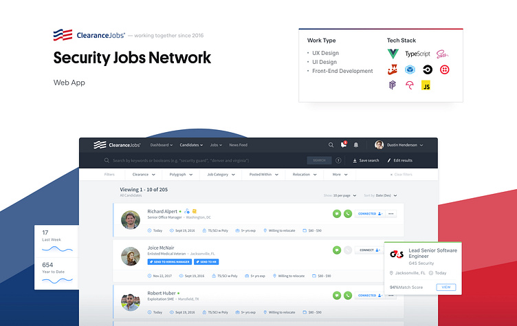
Clearance Jobs' Web App
As a result of two and half years of hard work where demanding challenges were taken, ClearanceJobs was released live in December 2018 and users are loving it!
Background
ClearanceJobs, one of the most relevant career websites in the US, part of DHI Group, Inc., reached out to Pixelmatters during 2016 with a clear goal in mind: revamp its platform from both a design and development standpoint, bringing it to the next level. One which ClearanceJobs wished to achieve for a long time.
Challenge
We worked on top of a live WebApp which features and flows serve the purpose of a vast user base. The definition of which direction to follow had to take in consideration who are these users, what do they do in ClearanceJobs and why they are using the platform.
With that in mind, Pixelmatters had to rethink the platform in a way that could bring a whole new experience to the target audience. It had to be intuitive, fresh, easy to deal with, responsive and most importantly, a clear evolution of the current application.
UX Thinking
Considering the product significant amount of features and complex structure, the first step was to understand what user flows existed to date and how features were organized inside the system.
Therefore, the strategy to follow had to ensure that users' navigation was clear and intuitive. Consistency, clear interactions and readability were taken into account as every detail matters when building solid foundations in order to scale.
Mobile Approach
One of the areas where there’s a lot of space for improvement was the Mobile experience. Taking into account the platform magnitude, in collaboration with ClearanceJobs team, it was decided to have a dedicated component Mobile approach.
With this strategy, the best experience was granted by using components that work similarly to native behaviors and with a custom UX for complex features in mobile devices.
Designing the Interface
After passing through the UX phase and make an important decision on the Mobile experience, we went on to create what would become ClearanceJobs new look and feel.
Having the brand guidelines in mind, several and thorough iterations were made: fonts, colors, iconography and so on. We aimed for a direction that is mature and solid, but also fresh at the same time, so it positions ClearanceJobs as a modern and trustworthy platform.
Design and Dev Documentation
Knowing beforehand that ClearanceJobs was a project to scale, it was crucial to have documentation in place. While the Design was grounded in a design system properly oriented to components, Development decisions and components were documented on top of Styleguidist.
In the long run, documentation helped to ensure the application's quality and consistency while speeding up the process.
Architecture Definition
Since the start, ClearanceJobs team was responsible for the Back-end. This implied the migration of a monolithic architecture, to a single page application where data is consumed using a REST service.
Always in close collaboration, Pixelmatters was focused on the Front-end and considering the complexity of the data structure, it was decided to use Vuex as the state management for data-driven UX control on the WebApp.
Development Methodology
To generate an efficient process, a set of rules were introduced following the industry's best practices.
Gitflow was used and a minimum code coverage percentage of 80% was set. Besides the existence of multiple environments, CodeCov was introduced to ensure that the project's requirements were met along the way. And, to avoid loose ends, even the pull requests followed a defined nomenclature. All set to a great collaboration on both ends.
Summing it up
We've completed a total redesign of ClearanceJobs WebApp and worked alongside ClearanceJobs development team to develop it, allowing a significant user base to have a new and refined experience!


