Get Lost (in a good way)

So a little back & forth seems to have suggested that a sort of "burnt orange" or similar color on charcoal seems to be the preferred combo. Plus some adjustments to line weights--I think it needed that.
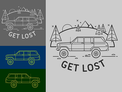
So a little back & forth seems to have suggested that a sort of "burnt orange" or similar color on charcoal seems to be the preferred combo. Plus some adjustments to line weights--I think it needed that.