Launch Loud branding

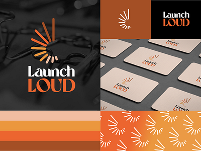
The inspiration for the launch loud logo:
The inspiration came from the idea of being loud, so the logo itself represents a volume dial and the impression of loud. The colour combination signifies - orange for the "loud' component and black for the class/elegance. White for simplicity.
Logo and branding designed by Donna Bouma at Design Capital www.designcapital.com.au