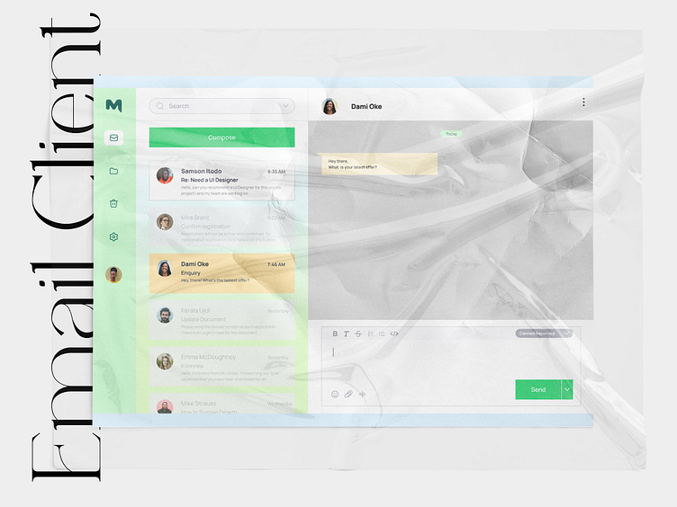
Email Client
Email can be clunky and boring to use. The modern online entrepreneur needs an email client that is fast, efficient and a little less formal. Busy people would rather text than email and the user needs features that automate their emails to help them spend less time replying to clients. Hence the need to redesign the email experience.
Research
Problem
In recent years, more teams are moving away from email and towards team communications platforms like slack and discord. Many freelancers are also making the move, but it’s hard to constantly invite new people to a slack channel for a limited engagement. This barrier hinders freelancers whom our target users fall under.
Risk if the problem is not addressed
Precious hours would be lost responding to cumbersome emailing.
Expected outcome
We expect online entrepreneurs especially freelancers will start adopting the tool and that it will reclaim hours of their days, weeks and years. A successful metric would be increased productivity for users.
Project Goals
These are the requirements:
1. Threaded chat-style email view
2. Canned responses
3. Smart folders and filters
Competitive Analysis
While carrying out the competitive analysis on two of the most popular email clients it was obvious that initiating the main task of replying to emails was still slow and needed some adjustments.
General Assessment:
Likes
1. I like the panelled design on Outlook
Dislikes
1. I’m not too fond of the overly white interface.
2. I'm uncomfortable with too many buttons and features that may not serve my immediate needs.
User Flow
The objective of this flow was to provide a user journey that gives the client easy access to canned responses, saving time emailing customers and eliminating redundancy.
User Persona
Wireframe
Several changes were made to the wireframe on the visual design. An example is the Compose button, which was at the bottom but later moved up for a better flow.
A second modification was how the user would get a canned response. The initial design on the wireframe showed a parenthesis function to pull up the responses. This was changed to a dropdown menu option.


