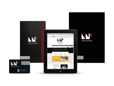
LNP – Luísa Neto Pereira Brand
Luísa Neto Pereira - Consultoria e Assessoria de Gestão, Lda. is a company that develops management consulting and executive coaching. The activity is led by the founder or and in collaboration with business partners. The company name is usually abbreviated by the acronym LNP.
I was responsible for the design of the rebranding of the brand’s visual identity, application to communication materials and creation of the website layout.
The assumptions were that the logo should be clear about the services provided by the company and that it could be based on the acronym (LNP) and geometric shapes - an evolution of the previous logo.
The concepts associated with the brand are: simplicity, linearity, technique, deconstruction, reconstruction. The values intended to be transmitted are: methodology, organization, differentiation and professional ethics.
For that, I used the three fundamental shapes of design: triangle, square/rectangle and circle and deconstructed them to form the acronym LNP (triangle = L for Luísa, rectangle = N for Neto and semi-circle = P for Pereira).
In addition, each element, if used separately, corresponds to each of the areas/services that the company provides (triangle = Consulting, rectangle = Coaching and semi-circle = Training).
This project was made at agency level and is the intellectual
property of Choice - Comunicação Global Lda.
