Veeza - Real Estate Landing page [Live🔥]
Hello Folks!
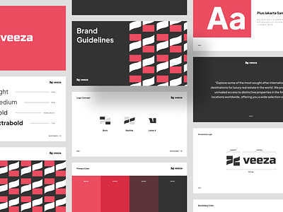
I’m excited to share the case study live website on Dribbble! This is my next exploration of a Real Estate landing page animation called Veeza. This website explains the project, experience, testimonials, etc. Here I rebound the logo Veeza that Faza created before.
The website uses fresh colors and combines a unique layout. It's already live guys! I worked with Tomy on this work. If you like it, you can share your love on this shot and check it on WEBFLOW 🔥. Cheers! 🤙
Full Page
Wireframe & Responsive
Wireframe from this website before it was made HiFi, and responsive which is displayed when opened using a phone
Typography & Color Palette
A brand system is something that every business needs. We should paying huge attention to every element. Therefore a font & color is extremely important for the brand.
Interest to partnering with us? Say hello at hellodama@odama.io or visit our website odama.io
Check us more at:
📷 Instagram | 🛒 Gumroad | 🎉 Figma Community


