SGNX entrance logo | by xolve branding
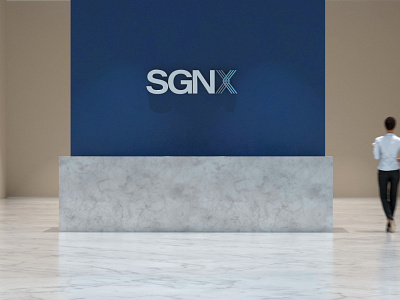
The design team approach was to focus the letter X, which abbreviated for ‘ exchange’. The letter X comprises of two woven halves, each represented sellers and buyers. The knot conveys the message of trust, connection, professionalism. The symbol also illustrates SGNX focus on mutual benefits and adding values to the community.
Full showcase - http://www.xolvebranding.com/work/sgnx/
Find out more case study - http://www.xolvebranding.com/works/
