Quickee Brand Guidelines
What is the face of your product? It's the brand and logo. Thanks to them, people notice your product among the others and get familiar with your company. However, the brand should be unique and catchy to get spotted.
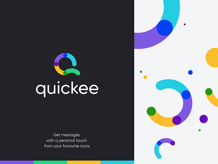
When working on the Quickee project, we did our best to keep the design bold. The color palette consists of bright colors that attract the customer attention. Since the Quickee concept bases on messaging, we came up with an idea of connection. The logo consists of four pieces that fit each other well, like Lego. We transferred this idea to the whole design and brand guidelines.
Have a project in mind? Contact us.