Parta — We make better decisions together
Alright alright. Time for some new designs. Let's go for this case format in exactly the same manner as on my personal portfolio, cause I'm boring like that.
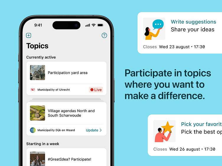
As a collective, we are able to find outcomes and solutions together. Parta facilitates informed, focussed decision making to support and broaden democratic processes. It allows everyone to contribute to ideas and decisions on various topics.
I redesigned the app over the summer in 2020 and joined the team as their first designer later that same year. We're currently iterating on the platform through learnings of usage by organisations and participants alike.
By using a timeline as an interface concept, participants are able to monitor and interact with decision-making processes.
Brand designer Hannah van der Mijle helped us out by creating a fresh identity for an international audience. After she created the foundations, I picked up where she left off.
Together with the devs, I created a strong design system within which we can review every scenario and user flow we can come up with.
And look at that. Even more icons. We use these to connect – sometimes – abstract concepts to conceptual models people may have about other digital or real life spaces. Think voting, collaborating, complexities, etcetera. My favourite is definitely 'provide us feedback'. If you can find it, you win a prize.
We like to know stuff for sure. Usability testing helps with that. Founder Lonneke and I tested multiple hypotheses within our first design.
Together with interaction designer Nikki Buitendijk, I improved the connection between the interfaces and the mental models they're based on.
Sjoerd van Leeuwen created some nifty illustrations and pictograms. Since we want to reach citizens from all walks of life, it's crucial to have the entry level be as low as it can possibly be. Visual recognition through imagery can help with that. We spent the hottest day of the year optimising colours and scannability.


