GC UI Style Guidelines
Hello friends 👋!
Introducing the GC UI Style Guidelines 😎
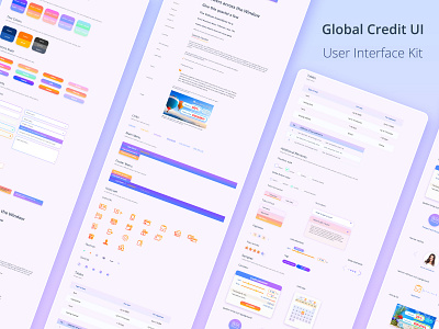
A set of all the elements on which the site is built (UI elements) 📜. Visualization of each of the elements 👀 at any stage of user interaction with the interface. It will allow you to quickly 🚀 and efficiently create each subsequent page using components and the model of the previous ones, is also the main design document of the project 💼, which is compared by all: designers, layout designers, developers at every stage of the project 🖼️.
UI-Kit consists of the following UI elements: Color Palette, Text Colors, Button States, Form Elements (input, select, textarea), Tooltips, Alerts, Typography, Links, Main and Footer Navigation, Icon Set (Icons, Glyphs, Social), Tables, Additional Elements (Checkbox, Radio Button, Tabs, Pagination, Accordeon, Calculator Elements, Slider Elements, Stars Range, Tags), Samples UI Components (Calculator, Calendar, Icon Section, Review Section, Articles List) and others.
UI-Kit is the first and mandatory element of any quality UI-design. It helps save time on creating new design elements 👌. You can read more about the case in my profile on Behance.
How it's looks 👀! Give me your valuable opinion.
===============================================
Don't forget to like👍 and subscribe❤️, there are many interesting and useful things ahead.
I am free for a new project.
Behance | Pinterest | Twitter | LinkedIn | Github | Instagram
Write to the mail: 📩 dedenkof@gmail.com
===============================================
Thank you for your attention!