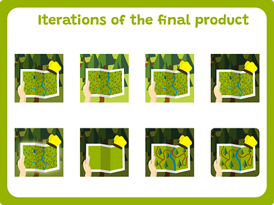
Iterations of the icon for the game
Here me and my team agreed on this specific visual. This said "A Walk in the Park" the most through all of the icons I made. I kept the butterfly which was something my team wanted to have no matter what the design was. I decided on a map held by a player with a forest background. This not only was associated with our game considering we have the same map in game but also is just associated with: forest, park, exploring, adventure, which are all the things we want kids to experience while playing. The first picture has the same map from the game scaled properly which when icon would be really small on the phone, wouldn't be visible that's why I decided on one without as many details.
More by Maja Witkowska View profile
Like
