BlackLeash: A dog-walking approach

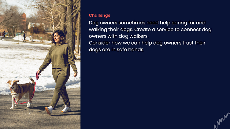
Challenge Overview
As part of the Dribbble Product Design Course, students were tasked with exploring and solving a relevant problem in the dog walking/dog-human(ing) space: finding a trusted walker. I took an approach mixing quant/qual research methods to break this problem down, brainstormed and developed a mobile approach, and then prototyped and iterated on a design direction with assumptions embedded. Below is a look into this process.
Understanding Phase
Topline:
Dog humans looking to find walkers are not currently served with a platform that engages them throughout the matching/booking process. Accordingly, the process of finding/setting up for a dog walk can feel quite transactional with current market solutions. These options stand in stark contrast to the quite impassioned and emotional realities of dog-parenting and cohabitation. My solution would need to serve as an 'engaging' + 'humans-friendly' space leaning on ui and presentation of general information to build inherent trust.
Work Done:
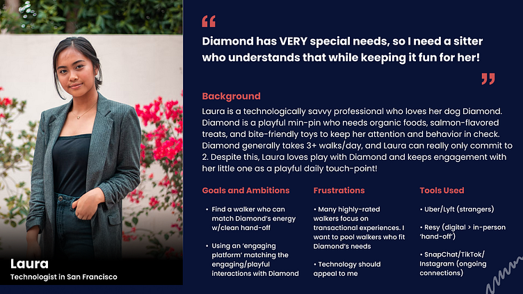
Research consisted of user analysis and macro market analysis. The user analysis stage included qualitative analysis into user insights and expectations across 1-to-1 research interviews with 3 users seeking walkers, observation/immersion of walkers on route and handing off around New York City, and quantitative survey analysis of metro-area individuals as dog humans (or hoomans!). Macro market analysis focused on established platforms utilised by walkers, walker groups, and dog humans looking to match and organise walks.
Outcome:
My solution would need to play on emotion and engagement lacking in current solutions yet SO vital to the experience of dog parenting. By focusing/extracting the minimum information needs for the walker booking/matching process, my platform could highlight a digital luxe experience and playfulness often seen both by those living life with the dogs they play with/care about as well as by design-led tech firms looking to build trust through technology. Gestures control, negative space considerations, and various use-case interact-ability would grant users that digital trust and appeal to unspoken user requests in the matching process.

Brainstorming + Organizing
Topline:
In exploring ways to use technology engagement as a way to build trust, I honed in on ways to playfully add a sense of craft to the potentially mundane process of information input. In my research it became clear that developed user mental models would not allow for over-extension, but I brainstormed around a common walker booking user flow (market analysis) and leveraged feedback (particularly from interviews and observation) to extend in areas around choice action and presentation of passive information. It was important that extensions in these areas were additive to the overall booking experience for users.
Work Done:
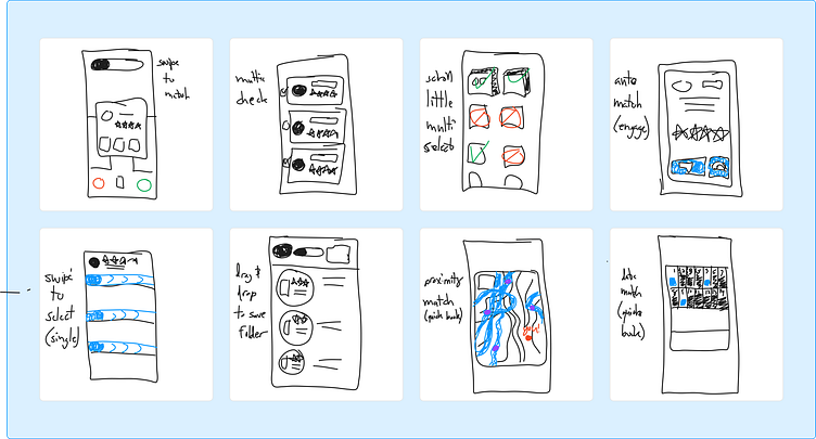
After finalising a rather standard user flow, I reviewed qual. user feedback to highlight key areas that could use additive extension through tech/mobile app engagement. These ares were in 1) book now opportunities and 2) active user matching to walkers. With this, I brainstormed and test-modelled various lo-fi and mid-fi methods to add 'play' with both booking stages.
Outcome:
Users giving feedback at this stage admittedly found it a bit difficult to imagine the entire booking user-flow as I isolated for extension phases of book now and matching. It became clear that user anchoring would would play a necessary step through other booking/profile management interactions. Accordingly, the focus of my extension to what was already in the market for booking now + walker matching would need to focus on gesture-control as the extension vs. brand new approach to information architecture. These insights aligned with review of my researched user base who were yearning for a more luxe tech experience. It would also be crucial to anchor to user mental models of the entire booking/walker matching process at any given point (for awareness/navigation purposes).
Design Direction + Prototyping
Topline:
Design for this app began with color selection compounded with a traditional minimalist approach as well as adding in hits of focused colour in hues of blue and purple. These hues were meant to match/inspire emotions of amazement, surprise, and pensiveness for users (aligning with feelings and emotions). Font and styles were meant to lean towards both business ('Roboto' as input and information display) and play ('Buffon' as brand and positioning). The mobile layout architecture fell on an 8-pt grid with a 4 x 16 mobile column structure to organise components and general information in a flexible way. All design + prototyping was completed in Figma for continuity of design approach, structure, and operability.
Work Done:
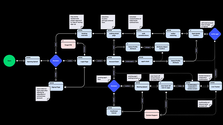
The overall themes in designing the booking/matching experience for users showed in 3 key areas: 1. navigation approach, 2. gestures (and extending into presentation of information), and 3. flips between light and dark themes to shift feel of active and passive user flows.
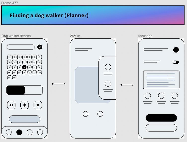
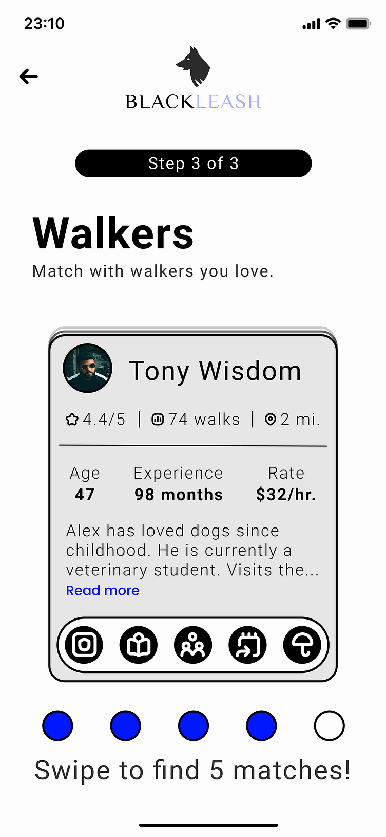
1. Navigation access > With inputting information as a key step for the general walker booking process, BlackLeash consistently shifts between common navigational tactics while reminding users where they are in the process. From page-oriented check-boxes and c.t.a status unlocks in the early input-heavy phase to thought quotes on loading pages for brain stimulation to 'Step of' progress bars, users can trust they will know where they are in progressing.
2. Gestures > Accordingly, swipes and drags are common in the interface to promote a higher level of engagement therein creating a greater sense of craft/imbedded trust in the platform. Matching becomes a 1-to-1 process where a given user is shown multiple vetted walkers they can opt into or opt out of. This crucial release of choice to the user unlocks both playful sentiment and 2-way trust in the platform. Walker information display aligns with general industry expectation of what a user can expect to choose based on, so the gestured act of the choice resonates as a differentiated experience for BlackLeash. As with 'Tinder' swiping, gamification and platform trust align in guiding users through an intimate process (filtering who to give one's heart to, even for one night, + filtering who to trust with one's dog).
3. Colour Theme > Finally, shifts between light and dark mode are meant to purposefully signal to users active vs. passive expectations for user behavior on any screen. Input and matching during the booking process lives as a light-backed flow as users remain alerted/active to input proper information. Meanwhile home base, login, and other review screens remain dark for more passive navigation and need for confirmation more than anything.
User Testing:
While user testing the platform with individuals from qual. research, feedback around navigation considerations and directions on how to engage was most common. Users were able to navigate through login/home-hub relatively smoothly. Confusion came when exposed to 'Book Now' functionality and walker cards for swiping. With this, changing the booking flow to light theme and focusing Home and Login/Signup flows on dark theme allowed for mental model to subconsciously departmentalise active vs. passive screens/interfaces. Also, adding in nudges and reminders on process for users ('How much is left') allowed for a more nuanced navigational calibration at any moment.


Takeaways + Next Steps
Assumptions Made:
1. Users see luxury as aspirational and as a form of innate trust-building. This requires one to consider the true place of access vs. exclusivity, of course, but at a basic level creating inroads to 1-to-1 walker matching, building 'exclusive' walker relationship in-app, and creating an elevated app ui experience could lead to a higher regard and/or trust for the BlackLeash platform.
2. Managing the dog-walker population through a database-oriented platform would allow for seamless roll-up with matching and data-tracking on trips per user. This would be a key implication of the dog walker matching experience outlined in BlackLeash.
Takeaways:
The process of exploring the dog walking space and creating an experience to do justice to those who live/breath it was invigorating. Uncovering the need for an elevated experience through various research felt authentic and exciting. Working to align on a method to capture this emotional need stood as a labor of love all along. User testing exposed a few assumptions I had but forced reconsideration of methods and approach in a nuanced manner.
(HUGE Shout-Outs to Tom Munday for the loading gif | http://tommunday.com/dog-walking/ | and Dave Coleman on the brand font 'Buffon' | https://www.losttype.com/font/?name=buffon)
Still left to explore:
1. At a certain level, hand-off flow would need to be built to create an omni experience between a dog human and dog walker confirming an appointment, confirming timing of an appointment, and both engaging in/reviewing actual dog hand-off for a walk. An element would also need to be considered for potential rating. A 'How it Works' page would be helpful and would benefit expectations here.
2. What other ways could BlackLeash extend on the relationship between dog, dog human, and walker established with introduced matching? Some ideas for relationship-building: a) test walks with matched walkers, b) matched walkers courses/education sessions in local dog parks, c) local dog store-vetter walkers and/or equipment recommendations, d) aligning matched walkers with 'neighbour matches' or grouped matching for multiple neighbours at a time.
3. Could navigation be condensed on user cognitive load even more? Could booking timing/dog detail pages be tabbed within a single page view to then leave matching as its own extending experience (in relation)? Could multi-select matching offer a quicker appointment match for users less-concerned about 'the process' and more concerned about 'getting a walker right now'? As currently constructed, pay details and appointment details come after walker matching but should earlier user education/communication call-out both expectations?
Thank you for your time!
-A.D