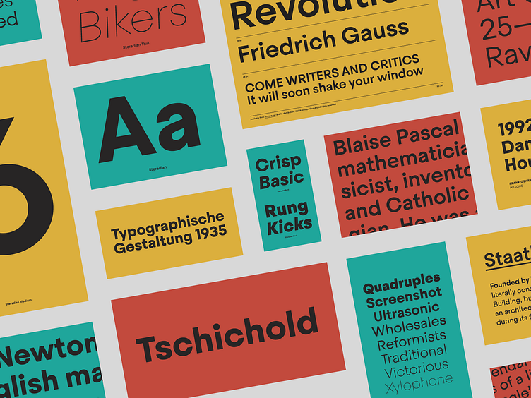
Steradian font
Steradian is an exploration of the geometric genre and although it has a geometric base, the widths between letters are not much different across the weights, something common of the style. That is due to the process, in which the proportions of the heavier weights paved the way for the lighter ones. It also has a series of details that make Steradian stand out and gives it a special touch.
Details
Some of the characters have distinctive features. In capital letters, ‘G’ has a notorious notch on the right bottom, and capital ‘Q’ has a prominent diagonal. Steradian has a double-story ‘a’ and closed apertures, like in ‘c’ or ‘e’. Some characters has diagonals cuts, like the ‘t’ or the Futura style ‘1’. Finally, letters like ‘t’, ‘j’ and ‘f’ have a sharp endings more typical of the English sans style.
Proportion
All of the round letters are derived directly from the circle, but the shapes are not slave to pure geometry. There are many different shades and variations across the family, adapting the original form to multiple widths and weights.
More about Steradian
https://emtype.net/fonts/steradian
Emtype Foundry
Type foundry located in Barcelona.


