Spring Point Partners
Spring Point Partners is a social impact organization that champions community-driven change and promotes justice by investing in transformational leaders, networks and solutions.
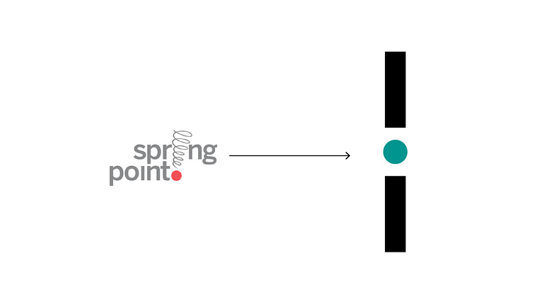
I've been asked to refresh their logo and extend their visual system. Inspired from their original logo, I activated the circle as the core idea to represent community and partners. By playing with the dot of the "i" in the logotype, it translates the idea of connection between people and the community. The logo is more simple, bolder and more visible in small space. I also extended their color palette and visual elements born out from the circle of the logo.
More by Jackie Jack View profile
Like


