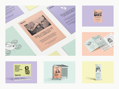
Qonto new print system
Hi Dribbblers!
I’m really happy to present Qonto new print system!
Qonto is an online payment institution, so the graphic design was naturally built around an exclusively digital system. However, the rebranding was intended to create awareness about Qonto by all means : it was necessary to extend this digital system in order to obtain a complete and more efficient communication. Since a digital system cannot be directly translated into print, we faced many challenges along the way, such as :
• Creating a print color palette that is coherent with the web one
• Establishing rules for the different formats: font sizes, strokes thickness, color usage, margins
• Defining standards for the use of illustrations and photographs
As you can imagine, it was not an easy exercise to rethink everything from scratch as printed media have many more different formats. You have to understand that web and print will never be exactly equivalent and are not governed by the same rules, but need to be as impactful! Finally, it enables us all to have the same standards and get coherent work that perfectly reflects Qonto image!
Share your thoughts and press 🖤 to like it!
—
🔥Ready for a new challenge? Qonto is hiring brand designers and product designers in Paris 🇫🇷, Barcelona 🇪🇸, Berlin 🇩🇪, Milano 🇮🇹. At Qonto, we also take seriously spontaneous applications.


