Ui design - Financial quoter
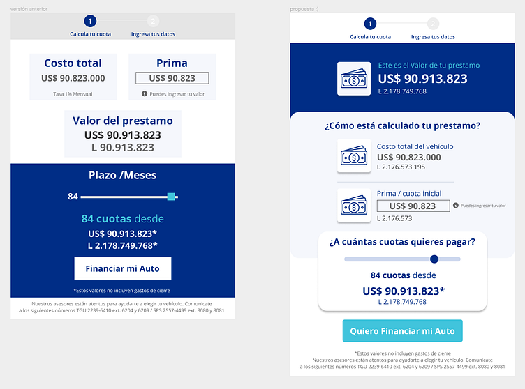
This module was redesigned taking the left-hand side of the quoter in order to make clearer the key elements when financing a vehicle. I proposed the use of icons, ux writting, tooltips and a bar to decide how many installments you need to finance.
What do you think about this design? Let me know your thoughts 🔥
✉️ Have a project idea? I'm available for new projects at kelly.castanedar@gmail.com
🔥 Tag your friend who likes it 😉
👉 Visit my page & don't forget to follow for more design content like this one!
More by kelly castañeda View profile
Like
