Cryptocurrency exchange P2P profile
Design decisions were inspired by Google UX Design course (week 1).
What makes a good user experience?
For a product to have a good user experience, it must be usable, equitable, enjoyable, and useful.
After analyzing 4 different exchanges' p2p user profiles, I created this version as an iteration on all of them.
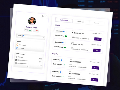
Usability: I added the "notification and star button" so other users can easily follow an account and also get instant notification once the profile has a new offer. Reduced clusters and ensured only the most relevant information is displayed.
Useful: The whole experience is designed to validate visitor's opinion about the profile, and to make it easy to execute a trade with the profile owner, I added an active offer session with a clear CTA and visual hierarchy.
Enjoyable: To ensure user participation, advanced details of the profile are hidden in a dropdown which will encourage the visitor to explore. Also, overall design structure is simplified; key metrics are put in Tabs, to encourage activity and easy navigation among options. Instead of endlessly scrolling down, you can easily switch from "active offers" to "feedback".
Equity: As simple as a one-page design, it is great to see how many personas were put into consideration when finalizing the structure/content of the design. Some people want to quickly see if the profile has good feedback; others, to confirm the profile's trading volume and speed of payment, and they are visitors who just want to quickly access the profile's active offers.
#dailyui #006
