Case study: Elizabeth Line diagram for a property company
Locale is a property services company based in the UK. They provide building management software that allows occupiers and owners to control and organise all aspects of day-to-day life in a large property.
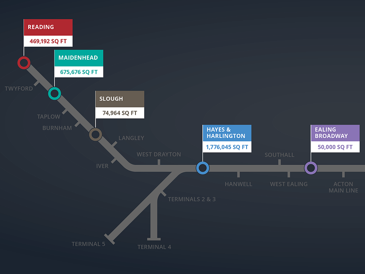
They wanted to celebrate the new Elizabeth line's opening in London, so they asked me to create a diagram showing their clients' properties near each station.
The first step is gathering the information I have to include in the diagram – the building names, their nearest stations and the rest of the new line. I roughly placed them together to explore how the diagram could look.
The properties fit but it's quite a wide diagram. How would it look rearranged to fit onto A4?
OK, that's probably more useful for the client. Let's use some colour and make it look more like the client's other marketing material.
I think is getting somewhere.
I'm not sure about the line itself though, it looks a little weak and it doesn't need to be official Elizabeth line purple. The highlighted stations should be more prominent too.
This works. But...
...this is better.
The client likes this but thinks the highlighted stations should display the total square footage rather than the building names.
No problem, but how best to show this?
Hmmm, the third version works best for me. Client agrees.
The client also prefers the original format. The diagram will be animated in a promo video and thinks it'll work better this way.
Put it all together and you get...
...the final, delivered diagram.
——–—–—–—–—–———
Hello, I'm Gareth and I'm a freelance graphic designer and I work as an external design and marketing resource for businesses small and large.
You can see more work like this at my website: http://www.garethrimmer.co.uk


