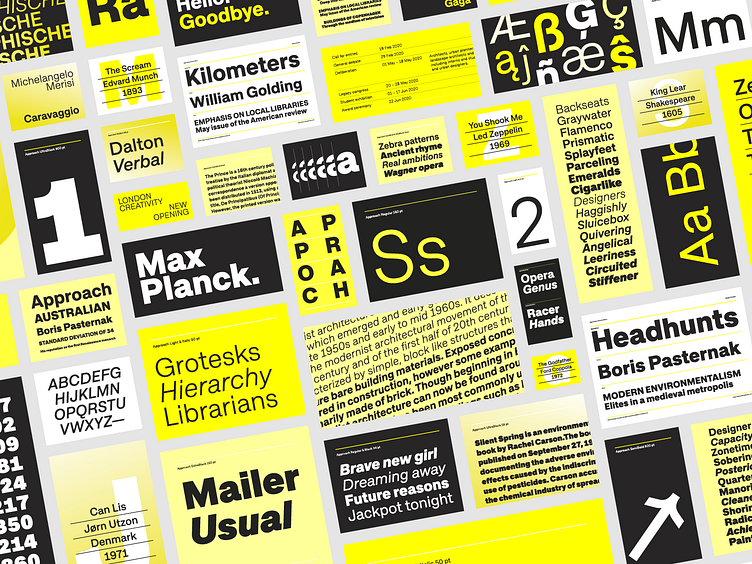
Approach font
A modern approximation to the early grotesques. A utilitarian low contrast font, a bit mechanic but plenty of character. One of its characteristic elements is a kind of ‘elbow pipe’ shape that is present in many letters like the tail of the a, f, j, t, R, Q or 1 among others. Besides, the synthetic punctuation and quotes give it a more contemporary appearance. Approach tries to feel fresh against all odds, being familiar but different.
Details
Approach has details from different typography periods. The diagonal cuts in the apertures are from the early grotesques. While the leg of the capital R comes from the neo grotesque style, for instance. Finally, the dots, the commas and its derivates are synthetic and more contemporary. The elbow pipe is a recurring detail and it is explained below.
Elbow pipe
A kind of ‘elbow pipe’ shape is present in many letters like the tail of the a, or in f, j, t, R, Q and 1 among others, becoming characteristic element of the font. This shape evolves naturally across the weights. It is a detail that brings a geometric touch, a softly mechanical nuance that reinforce its personality.
More about Approach
https://emtype.net/fonts/approach
Emtype Foundry
Type foundry located in Barcelona.


