Camlin | Brand Architecture & Packaging Design


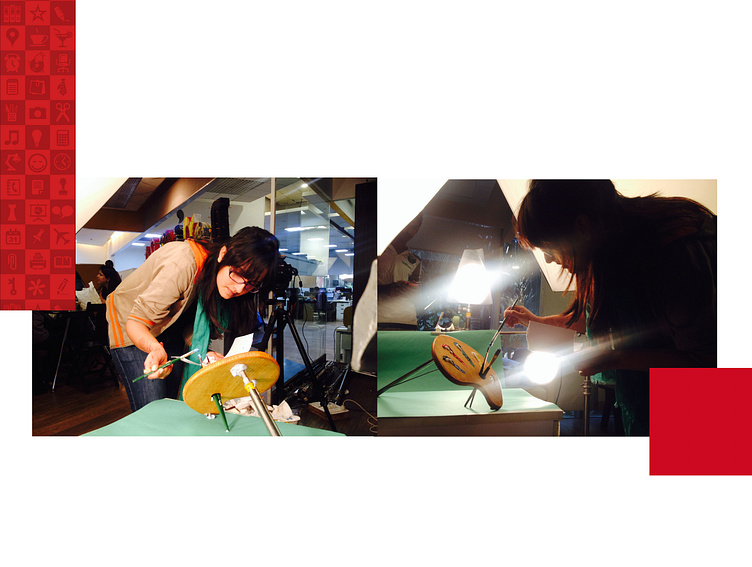
Camlin Kokuyio Limited occupies significant presence in the domain of student/office stationery and art materials. Their product portfolio grew with need of the market and projected a segment specific image. Now the brand aims to unify their diverse portfolio under a strong brand architecture defined by the core theme of “FUN”. Here's an interpretation of fun in context of opening up the doors of creativity. This project was executed as a team work, where I specifically contributed in ideating on mood board, developing icon system and art directing the photoshoot for new packaging design.
Design way forward
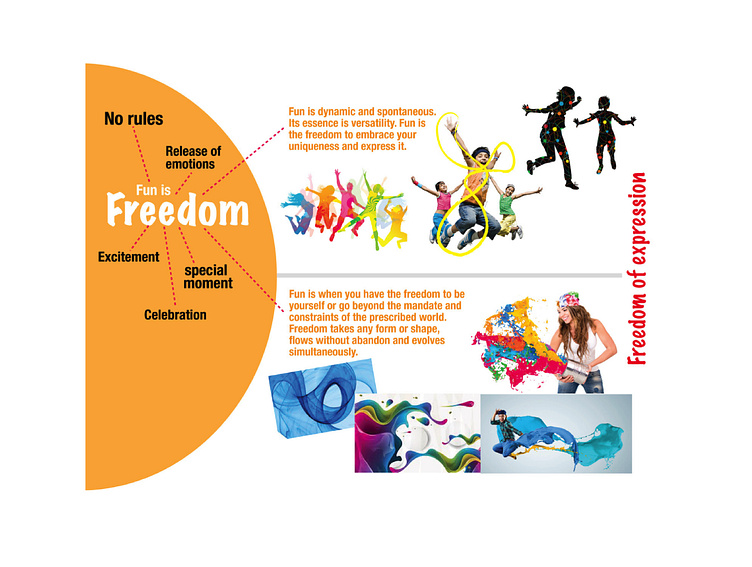
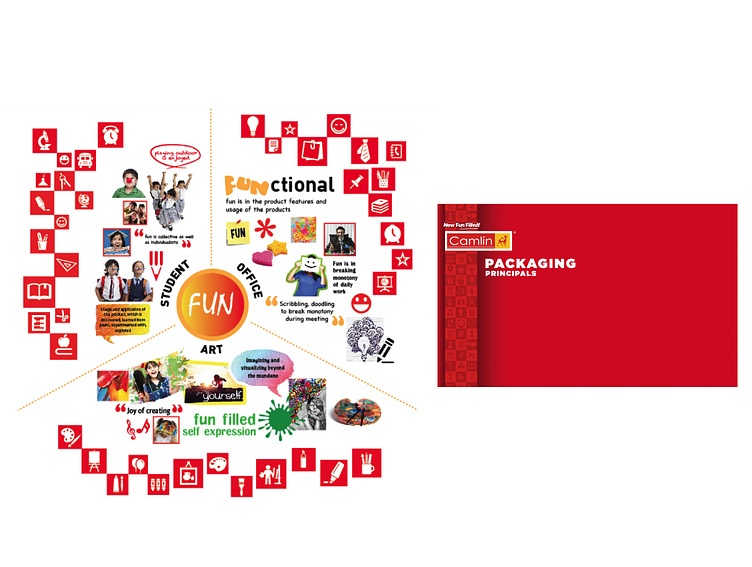
The process began with scanning through various aspects of life to capture the essence of fun and interpret the behaviour of fun for the core user base - students, professionals & artist. Each of these users share the common emotion of having fun and feeling free.
Later this understanding was translated into visual form which was represented as fun icons. These icons became part of the unified brand architecture band.
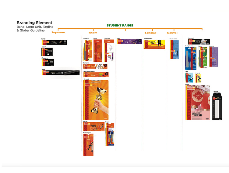

The entire product range of Camlin was unified under one brand umbrella which extended beyond the packaging and became an integral part of the brand system across all the engagement touch points.