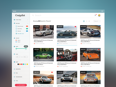
Craigslist Redesign
Hello fellow designers,
I've been using Craigslist a lot lately and asked myself why shouldn't this awesome product deserves a facelift. I know CL has good ux but come on, It's 2014 and now we expect both (ux and visual). So I spent a few hours of the weekend redesigning Craigslist listing page. I know my design has bunch of ux issues but hey I spent only a few hours and it's just for fun - no deep thoughts. Some key points:
✔ It's cleaner and easy to scan.
✔ On original site filtering options are in different locations of the page and some are redundant. So I organised them a little bit and placed all the filtering options on the left sidebar.
✔ Big prominent search bar because this is what I use most.
✔ Ability to see multiple photos of a listing by simply hovering over and moving the pointer left-right (second picture on top raw). No need to go details screens for more photos.
Please checkout the @2x version for sharper UI and let me know your thoughts. Press "L" if you like it. :)


