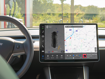
Empathic Redesign of Tesla UI System
This is my first major case work that I did for my Master's Thesis.
The purpose of this project is to identify key problems Tesla screens have that makes it hard for users like Seniors to use. This is to redesign the home screen and user journey, not actually redesign each component. Making sure that users can safely and quickly access features without issue. Wanted to give users the ability to customize their screens based on what they need, such as enabling labels for buttons, customize sizes, dark/light mode, etc.
The Knowledge research I done concluded that when given a list of tasks, users are only able to complete 50% of the tasks, and of those tasks, they take a long time to finish (average 25 seconds).
My redesign shows a possible prototype solution that solves the issues found while using active feedback from users who match the persona of the project.
Read more here: https://docs.google.com/presentation/d/1SsHzez8qRGxsMgiPBdEUs3mHyau4Zn6pz8xU6iWxQhA/edit?usp=sharing
