Paydi - Payment Mobile App
Today we’d like to share our concept of an online payment app! Nowadays, Payments in all sales stores have changed to online. therefore an application to make payments must exist. We call Paydi for this app.
________________________________________________________________________________________
The Screens
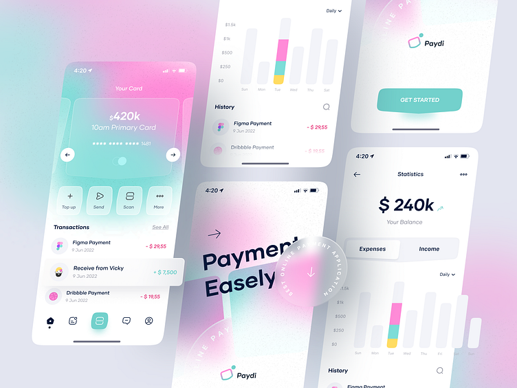
The first screen is an onboarding page. We create eye-catching designs by giving a modern glassmorphism effect and CTA Get Started.
The home screen displays available bank cards, and several buttons for actions such as Topup, Send, Scan, and more. Also displays a list of the last transactions made by the user to make it easier for users to remember transactions.
The Statistics screen displays available balance, expenses or income that can be displayed daily, weekly, monthly, yearly or even all of them. Also displays the history of transactions
The Wireframes
We try to make a simple and modern layout, because the target market of this application is young people, while still showing on-point design.
The Colors
according to our target market, and we want to be different from similar applications, we choose a color combination that is really "gen z". we believe this color can attract the attention of our target market to download the application.
The App
and this is an example of the application of our whole concept.
Have a good project? Let us know ✅
💌 10am Email: Message us
😍 10am Instagram: Follow us
🥳 10am Product: Creative Market | Gumroad | UI8
-----------------------
I'm available for freelance projects. So let's talk or hit me up through email at wildanux@gmail.com
Follow me on Instagram @uibywildan


