Camel Travel Branding
🐪 Camel Travel is a UK travel agency based in the Canary Islands, according to the clients. Their services are like living in paradise, inspiring clients to plan their own memorable vacations all over the world.
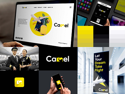
So, for the client, I created this negative space logo. Visitors will remember it and find it more appealing.
In addition, I use the color yellow, which in most cultures represents happiness, warmth, and sunshine; these are characteristics of the yellow sun and its effects.
Black is a color associated with mystery, power, elegance, and sophistication.
Following the logo, I created some mockups and edited photos for the presentation. Finally, the moment arrives when the clients approve the logo branding.
Thank you for taking the time to read about my logo.
⚡️ For more -
dribbble I instagram I behance
⚡️ Let me know if you want to hire me -
Mail- rashedkhanmenon92@gmail.com
WhatsApp- +8801965514224
