Vmail
During the last portion of my Dribbble Product Design course, I was presented multiple options of a "capstone project". For mine, I chose to focus more on the UX portion and dive into the how/why of a project, rather than the "how it looks" portion. I felt like I could go on for days into how it should look and even the general overall, but during the course I felt like this section of Product Design was sort of quickly gone through and hard for me to completely grasp at the moment.
When I got past the wire framing stage in our first project, I felt like it was all smooth sailing - like it was easy. But when I looked back I saw that the first stages (UX) were more vaguely developed in my thought process, so I decided to choose the email application development project.
The overall project was a great case study in understanding not only the needs of the project, but my over-thinking in final outcomes right after diving into the project itself.
User Persona
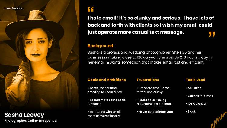
For this particular project, we were given our persona and informed of their needs upfront. I found this very helpful in understanding more of what I wanted to accomplish, but more importantly the direction the end product needed to be steered toward.
Problems to Solve
The persona described is used to a number of easier to manage and use applications for communicating and finds the classic email formats too clunky and inefficient.
The problem is that email is too traditional and not as conversational as more modern forms of communication. How can we bring the two together to make email be as fluid and intuitive as text messages or group messaging applications such as Slack or Microsoft Teams?
Secondarily, can we add in customizeable "canned responses" to speed up replies?
My Role
My task in this project is two-fold: bring the easy functionality of modern messaging applications to the tried-and-true email format and add in the quick-response format of canned responses.
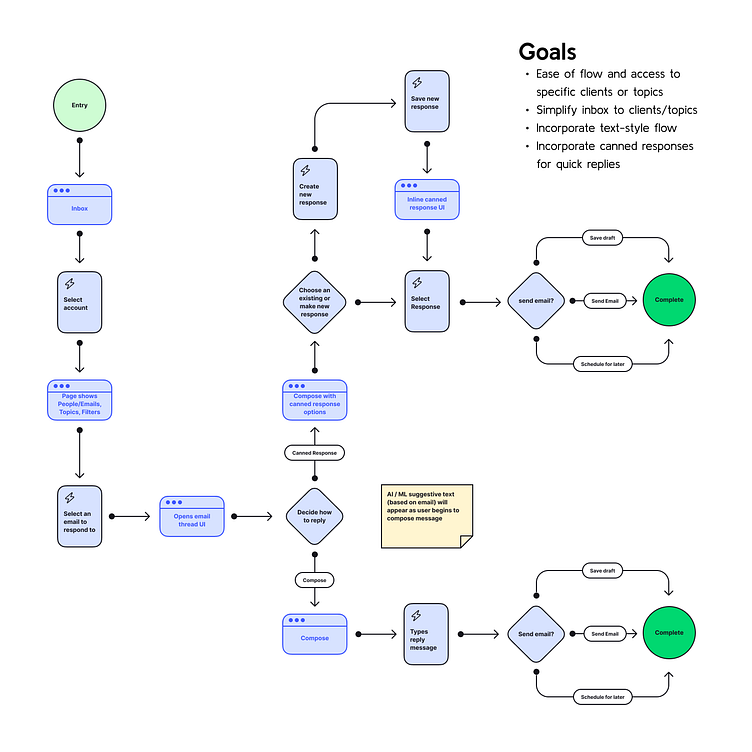
User Flow
Given the task of making it not only comfortable but quick and efficient, the user flow needed to be simple and quick, decisive and straightforward. When making the flow, I wanted to show how it would be easy to quickly accomplish exactly what you set out to do: compose a unique response when needed or select a responsive or "canned" response.
Design Process
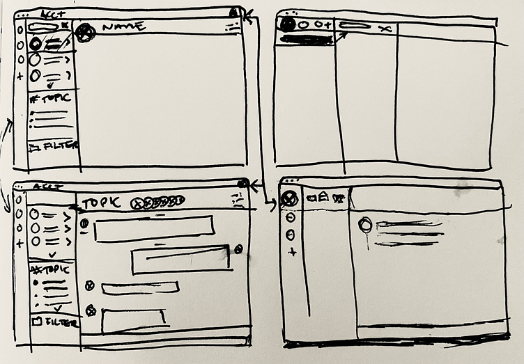
Low-Res Wireframe
In a quick brainstorming session, I tried to tie in some of the best user-experience functions from more modern messaging applications such as Slack, Microsoft Teams, and Apple Messages.
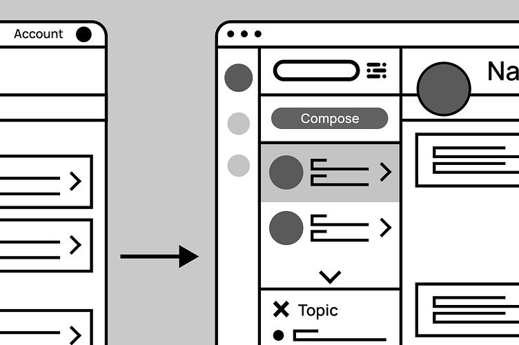
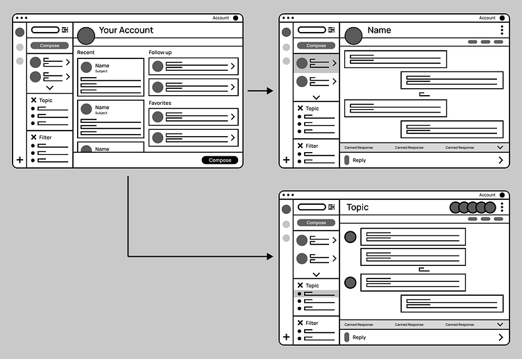
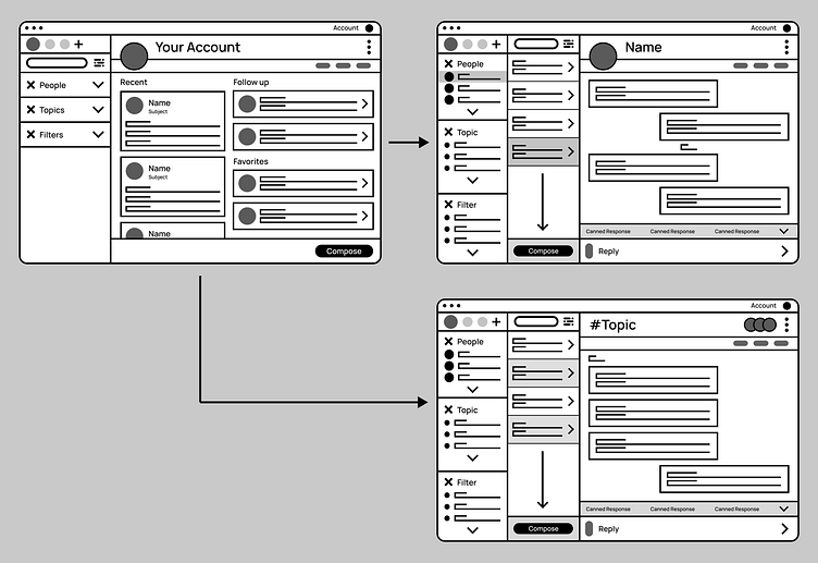
Hi-Res Wireframe
After further development, I found my two routes of layout viable to explore - both slightly different, but overall highly functional. I wanted to include a landing page that would provide quick access to ongoing conversations, as well as new and pertinent mail.
Both options were created to take advantage of available space to incorporate simplistic access to current conversations and new mail, but also:
1. Accounts - in case the user has home, work, or other accounts
2. People - direct selection of people/companies, similar to messages or current email format
3. Topics - specific related topic conversations that are quickly grouped and ready to view - conversationally divided
4. Filters - similar to topics, these are customizable, searchable, and easy to access - based on specific keywords/topics/people
In my first option, I chose to offer up a larger message platform with more focus on the conversation between the client and the user.
In the second option, I wanted to spread the options out to be more visible and accessible.
All the while all traditional options for email were carefully thought of and placed to fit in this new format - some of which being available in dropdown menus.
Conclusions
This particular project taught me that it's very easy to dive into the deep end of visual design/UI well before the previous steps have been developed and thought out.
While it's easy to think of how something can look and be laid out, its more important to take the time to think of what the user really needs in the beginning so that the framework is there to polish into a beautifully designed product.
I found my brain skipping past steps, only because I thought I knew how it should be. It wasn't until I stopped and looked back at my sketches that I realized the true intent of the project: understanding the importance of the framework to ensure the user is presented everything needed to accomplish their intended goal.
This has truly been an amazing exercise in wrangling in one's brain from overthinking to accomplish what eventually seems much simpler and exciting than it does during the process.
Next Steps
While the objective was to simply layout wire framing, I believe I'll continue developing the concept into something more viable that I think could become a presentable/developed project.
Regardless, I'm thoroughly excited about continuing my journey into a new design field.
I'll update this case study when I've developed Vmail into it's true potential. Until then, thanks for checking out my project!