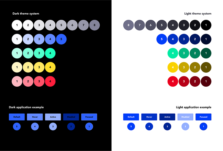
Color System | Dark & Light Mode
Overview:
A systematic approach to implementing a cohesive light & dark mode throughout our platform. This approach was introduce by .
Problem:
Our initial attempt at designing a color palette was based on competitive research & brand identity word clouds. While this was a good thing for the brand, it was a bad thing for building a cohesive design system across the our platform.
For example, if we used one color for the dark mode, the light mode version of that color was simply memorized by the designer or decided upon on the spot. This wasn't going to scale as new employees came onboard, plus, this ruleless approach made it impossible to write the code necessary to have a dark & light mode across the platform.
Solution:
I did some research and found an approach written by Pete Woodhouse that seemed potentially effective. Essentially, it's a number matching system (i.e. Dark-Blue-1 is equivalent to Light-Blue-1). I created each color simply by reducing/increasing the shade, checking WebAIM for accessibility, then editing if needed. This number matching approach allowed the development & design team to know exactly which color goes where, regardless of the product feature being new or old.
