Inhabit | Platform v2
Inhabit | Platform v2
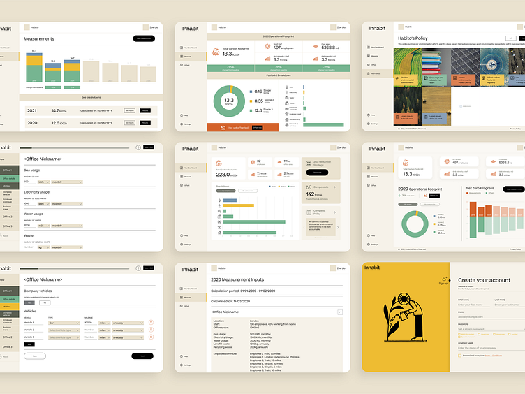
Inhabit is building a platform to help SMEs measure their footprint and reach carbon neutral. I joined the team at its very early stages as their sole designer. There was not a brand style nor a fully built platform yet, so I had all to play with.
After our first platform design, we worked with Pentagram to build a set of brand guidelines for the next round of fundraising. After a visual style was created for our marketing collaterals, I was tasked with redesigning our platform using the guidelines as a reference. The difficulty here was that the brand created was very marketing focused, so visuals with minimal layouts, big punchy typography, and a multitude of colours meant that it wasn't very user friendly or practical when transferred onto a digital platform.
However, I was keen on keeping the platform consistent with the external brand so I focused on keeping the layout of the platform minimal in terms of colours and only used the colourful elements for specific parts such as graphs, and kept the bold punchy typography only for key numeric data points. I also tried to keep the minimalistic approach in terms of layout on our branding by removing unimportant details from graphs such as graph axis which would add to cluttering the interface, and labels which could appear with hover and other interactions.
See the full project at: https://dribbble.com/zlcreative/projects/5769891-Inhabit
-----
Like what you see? Get in touch with me: zlcreativedesigns@gmail.com
