Interco logo
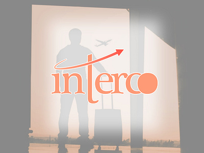
I designed this logo for a travel agency
-orange for the warmth
-the o depicts the sun
-the bottom of the letters depicts waves
-the letters are overlapping to depict the connexion between countries
-the arrow of the t is an abstract plane and shows the right direction
J'ai conçu ce logo pour une agence de voyage
-du orange pour symboliser la chaleur
-le o représente le soleil
-le bas des lettres symbolise les vagues
-les lettres se chevauchent pour symboliser la liaison entre les pays
-la traverse du t symbolise un avion abstrait et dirige vers la bonne direction
______________
Photo credit : unsplash
