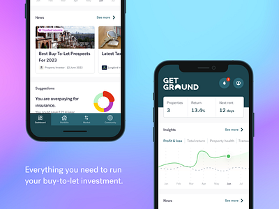
GetGround mobile app (concept)
If I blink and think of all the user research we have done at GetGround, and ask myself "What would a GetGround mobile app look like?" then this is the result. There are threads of current projects, a brand new "News" section, a couple of teasers in the nav, and a simple layout. The user needs are driving the feature choices and hierarchy. Has it been thoroughly thought through and validated? No. Is it a bit of fun, and design therapy? Yes. Let me know what you think!
If you're interested in talking more about GetGround or UX design, find me here on LinkedIn.
We're always on the lookout for great designers at GetGround, check out our open roles here.
More by GetGround View profile
Like
