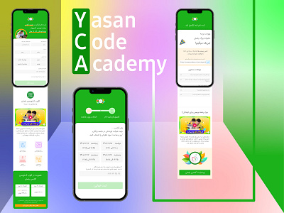
Yasan Academy's landing page (mobile)
Hey there!
according to my previous shot description, here is exclusive mobile design of YCA's landing page.
I highly recommend you check my previous shot to see desktop design of the same process.
based on business needs and it's objectives, we decided to shorten the pages and decrease the steps to 3 to make it simple and straight to the goal of users, the form submit.
the form is at the top and the other contents are around the subscription and filling the form.
I really appreciate if you like and follow😍🙏
More by Mohamad Ahmadi View profile
Like
