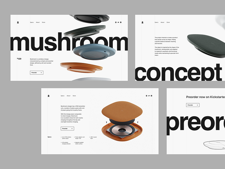
Wireless Charger Landing Page Design Concept
Got tired of cables entangling your workplace? Puzzled about what charging device you need to grab this time?
We had enough of that too, so here is a landing page for a cutting-edge wireless charger. The clean layout with lots of air represents the empty space around you: no distractions, noises, and nasty wires. While designing these pages, we opted for minimalism, a monochrome color palette, and monumental typefaces. The only color drops are images. This solution helps concentrate the attention on the product itself.
The product design by Mirko Romanelli.
Let's collaborate!
hi@conceptzilla.com
Discover more about us at conceptzilla.com
More by Conceptzilla View profile
Services by Conceptzilla
Like
