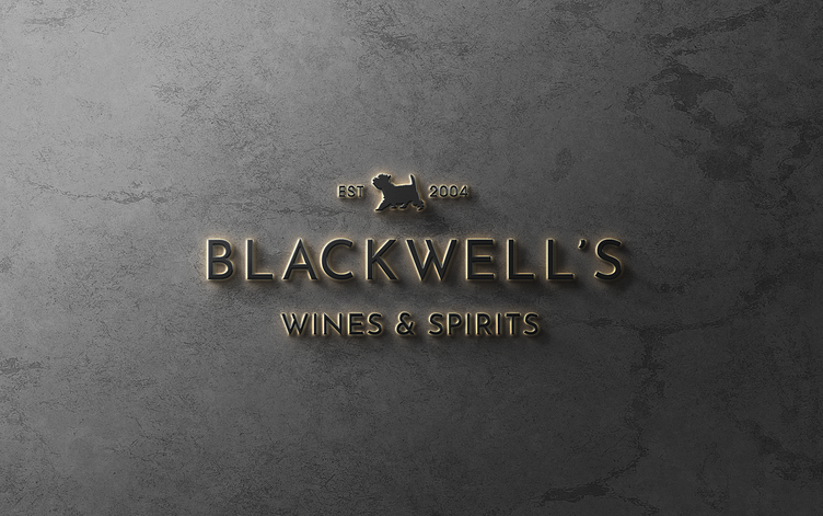
Blackwell's Wines and Spirits Brand
Blackwell’s Wines and Spirits has been a trusted family run business since 2004. Dita and Gary have built a loyal following and now have two store front locations in San Francisco and San Rafael, and a booming online store shipping globally.
Loel and Stacey created a theme inspired by 1920s glamour but rather than leaning into the more expected prohibition theme, we went modern and minimalist. The color palette was inspired by popular 20s cocktails and the typeface choice was also a revival of 20s style through the lens of current day. The little dog mascot came from a sweet story about the owner’s dog, Pastis, who used to trot around the store helping customers choose their bottle. Pastis has passed over the rainbow bridge now, but loyal fans of Blackwell’s remember him and so this became a central icon.
After creating the brand guide and assets Stacey began the challenge of creating a UI design for their already large Shopify online store. It needed to be minimalist and elegant while still being whimsical and fun, like a visit to one of the Blackwell’s stores. She created a sub-brand for their clubs and a system for marking staff picks as “Pastis’ Picks” with the little gold dog icon. Bryn did the heavy lifting on the website planning, functionality and build. It needed to have a complex menu allowing customers to hone in on their coveted item while still allowing them to browse casually if they wished. He worked closely with Gary Blackwell to ensure that every detail was brought forward into the new design and that any problems they’d suffered in the past were resolved.
While the paper shortages across the world raged on, Stacey worked with vendors to find paper and take Loel’s stationery designs from concept to completion. Their stationery is another example of old and new worlds meeting. Stacey arranged for gold foil on many pieces which is a very deliberate nod to traditional wine and spirits labeling but instead of white or ivory stock she sourced a warm pale grey, pushing this look into a more modern place again.
Loel created a social media kit for Dita Blackwell to use on Canva with her staff. This is a DIY approach we are using with clients who are not quite ready to hand over their social media management to a firm. This way they have means to create their story in their own time with their authentic touch but with lots of templates and brand assets arranged by us.
Cheers, we’re pleased with the final results and are looking forward to visiting our new friends over at Blackwell’s whenever we need to find that perfect pairing.
The team:
Art Director: Stacey Clarke
Sr Designer: Loel Mitchell
Developer: Bryn Howlett


