Branding for VIM
VIM gets a new look
Rebranding an architectural software start-up
In 2018 I led a branding team for VIM AEC, a growing tech company serving the architectural, construction and engineering markets. The company grew rapidly and evolved to a point where brand evolution needed to take place. I was hired again to lead a deeper brand evolution alongside their head of design.
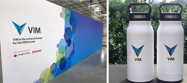
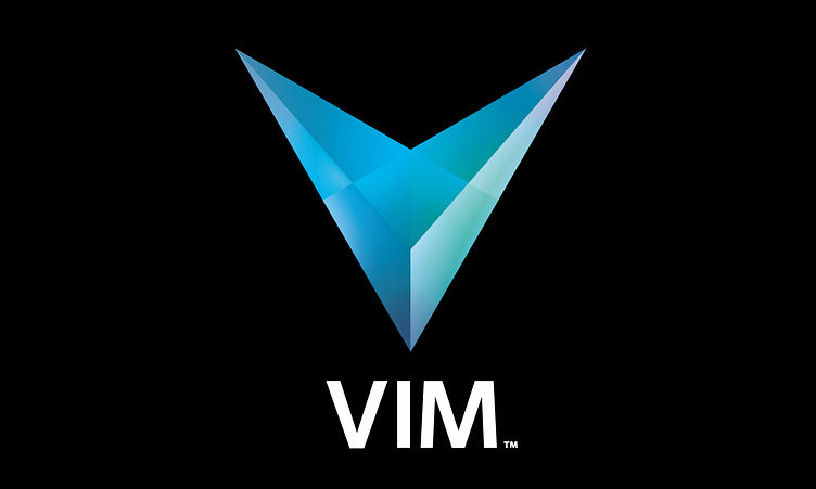
We honed in on hexagons in early sketches and built a concept around both the science and mythology of hexagonal imagery. The final mark came from a period of going over my own previous academic work on sacred geometry. I began with a root three rectangle and within it was a hexagon bisected by lines in every direction that made it feel very three dimensional. Within that space one could see a V, and tracing over and and over I found the lines that would become our logo with its light-reflecting facets. Having a three dimensional logo provided many challenges but in solving each one we kept deepening our understanding of this mark. I created the brand guide, graphic assets to support the UI team, social media templates, presentation slide styles, web banners, stationery, business cards, stickers, shirts, notebooks, water bottles and the artwork for a 29' trade show booth for Autodesk University.
The team: Art Director: Stacey Clarke Creative Director: Luke Hamilton (Head of Design at VIM) Additional Late Night Critiques: Stacy Messerschmidt