Inbox zero case study
This is one of the capstone projects for the Dribbble product design course. The task for this project was to create wireframes that achieved the project goals using the rudimentary design library provided. User research and overall project goals were provided.
The emphasis for this project has been on spatial layout and functionality with some additions to the design library.
Designing the app
Low-fidelity wireframing
The first stop was to creates rough sketches of email and messaging apps, along with a list of functions that each had. These were used to decide which functions were necessary to include, which to hide and which to leave out.
User flow
Working through how a user could reach inbox zero, it was decided that the journey would depend on two types of functionality: actions and views.
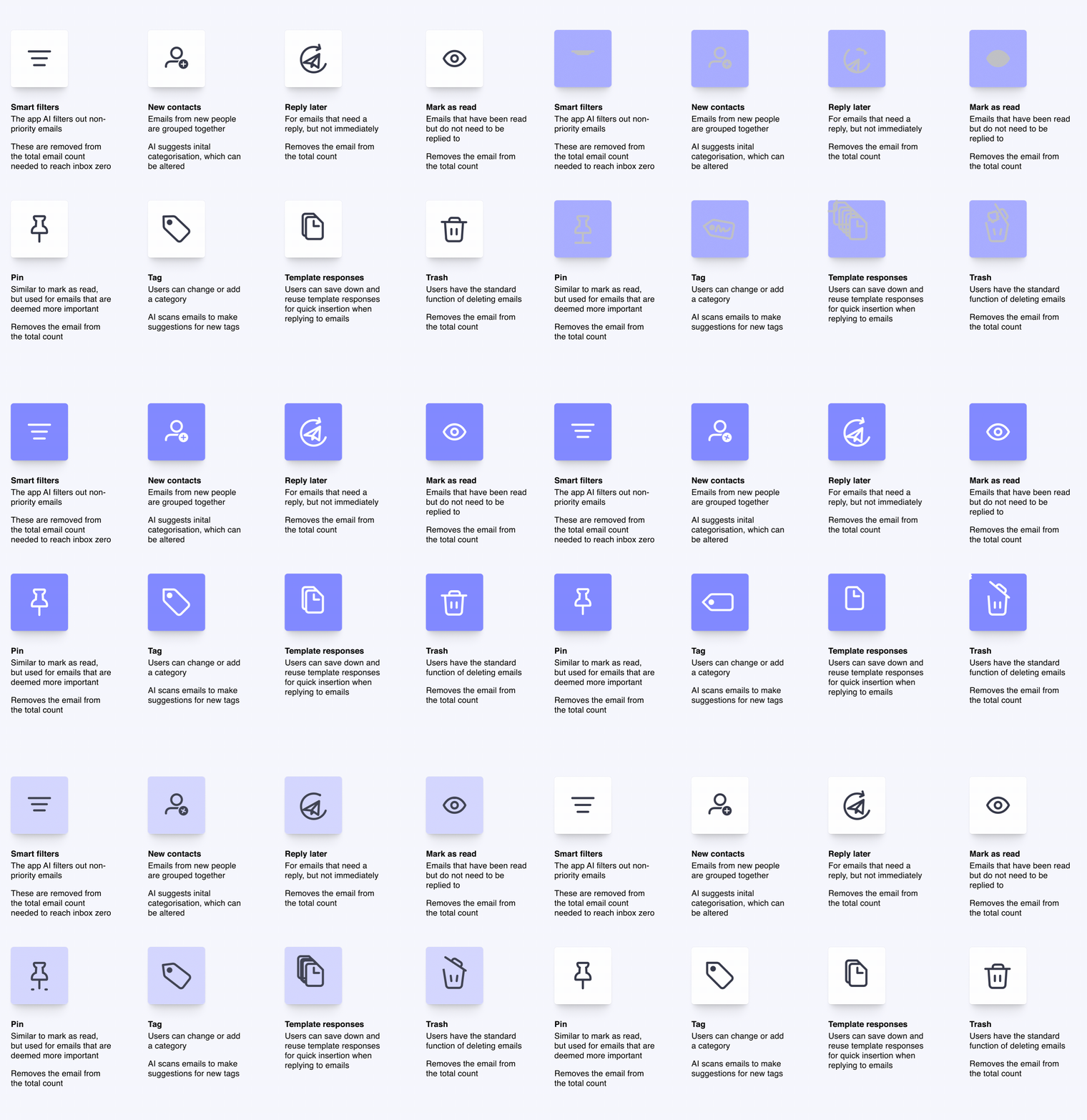
Eight actions were identified that would help users clear out their inboxes more quickly: smart filters, new contacts, reply later, mark as read, pin, tag, template responses and trash.
The actions were relatively more straightforward to develop in the user flow. There remained, however, the lack of a visual signal that the day’s work had been completed. In order to address this, the idea of creating a specfic view for emails that would provide that signal was chosen.
Actions
The actions identified to help users get through their emails more quickly also contributed to achieving the goals of the creation of smart folders and topical organisation.
The functions that help users reach inbox zero quicker and more efficiently are:
Today view
In conjunction with the above actions, the app was designed to display the emails in different views based on date with a function to set the end of the day.
The views that can be chosen are All, which corresponds to the traditional inbox view, Today, This Week, This Month, This Year, Select Date. The different views will show only emails for the specified period.
Only in the Today view can inbox zero be reached.
The end of day function was added because practically there needed to be a cut-off point, or inbox zero would most likely never be achieved. Additionally, it would give users a sense of control over their email schedules rather than being controlled by it.
Progress to inbox zero
Once an email has been replied to or actioned using one of the functions listed above, that email is removed from the Today view and no longer counts towards the total, bringing inbox zero closer.
At any time in the process of actioning emails, those that have been marked as reply later, pin and mark as read can still be viewed in the Today view by selecting their respective buttons on the button bar in the contacts/email preview panel.
The button will show only those emails and hide other actioned and unactioned emails. The email total count display does not change.
KPIs and game
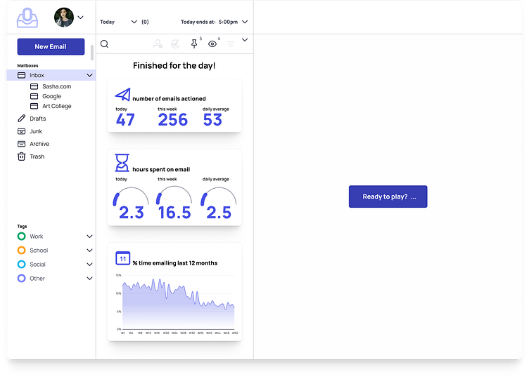
The final part of the solution was developing the inbox zero screen.
In order to generate a feeling of satisfaction at having actioned all emails, the final inbox zero screen combines the ideas of Apple’s weekly screen time report and the recently popular online game Wordle.
On the left of the inbox zero screen are KPIs of the users’ email activity, providing a gauge of how well they are doing in reducing the time spent emailing. The stats provide a goal for users to maintain or better.
On the right is an invitation to play a game. Like Wordle, it would only be able to be played once a day.
The intention is to give users some satisfaction with completing their emails for the day. Even if their email activity hasn’t decreased, at least they can play a game and perhaps make emailing less onerous.
Reflections
At first when I saw the capstone projects, I thought that I didn’t want to do this one. It didn’t seem very interesting. Once I had decided to make the project about achieving inbox zero and what that would look like, the project became a more interesting challenge.
On a practical, skills-based level, I started using auto-layout from the beginning and have come to appreciate its possibilities. Additionally, creating interactive components started at a much earlier point than the previous project and helped make designing quicker. I’ve included a few screens below of some of the components.


