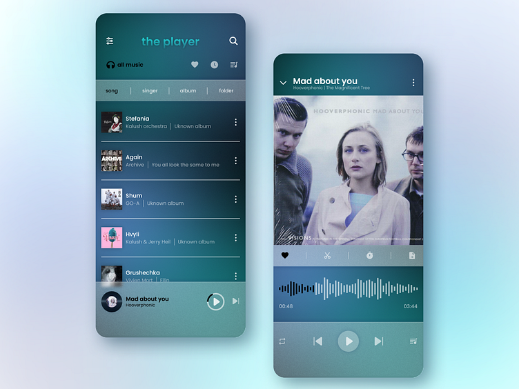
DailyUI009 | Music player
Hi guys!
Here you are my new shot with music player screens. And its the ninth task of #dailyuichllange
.
Design Hint...
Design a music player. Consider the controls, placements, imagery such as the artist or album cover, etc. Also, consider the device type that's playing the music. A dashboard in a tourbus, a smartwatch, or via a web browser. Each deveice type will have different requirements, features, and restrictions to consider.
.
It was not easy task for me, because I rarely listen to music. So I needed to search a lot to explore this issue. But then I understood that it's just ui challenge (not ux). So I've created two mobile application screens - playlist and now playing, as I think it has to be.
The main refrence was MiMusic.
I've used gradient backgraund (made by blured elipses), dark design and pannels with glass effect with noise. All icons I've implemented via Figma plugin Iconify.
.
I hope you like it 😊
Don't forget to press L ❤ and text few words whether you liked this shot
Thanks
.
