Kiba Saigon paper bag | by xolve branding
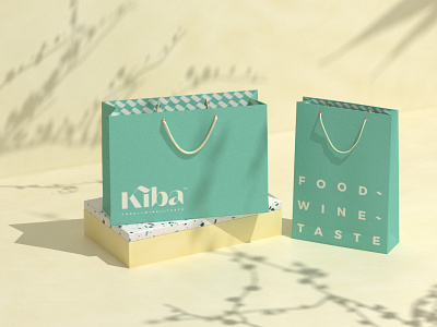
The design team strikes to emphasize the meaning and the message behind the brand name: triple the attentiveness, triple the carefulness, triple everything. The tilde sign is used as a pattern, and an element to create the icons.
Full showcase - http://www.xolvebranding.com/work/kiba-saigon/
Explore more case study - http://www.xolvebranding.com/works/
